19th March - 25th March
Partner Company: Applied Works
Brief: Design a way for people to experience The Hoffman Centre collections
Group: Maria Shuttleworth, Tatiana Bohsali, Qendresa Selimi, Kate Chernysheva
Partner Company: Applied Works
Brief: Design a way for people to experience The Hoffman Centre collections
Group: Maria Shuttleworth, Tatiana Bohsali, Qendresa Selimi, Kate Chernysheva
Final week of the project was the most enjoyable as we saw our hard work coming to life in the shape we imagined it to be. We all agreed with the comments from last week and decided to focus our attention this week on creating a uniform visual identity, drawing a clear link between the AR and the Website and, of course, developing our prototypes to the point where it can be used, rather than just viewed.
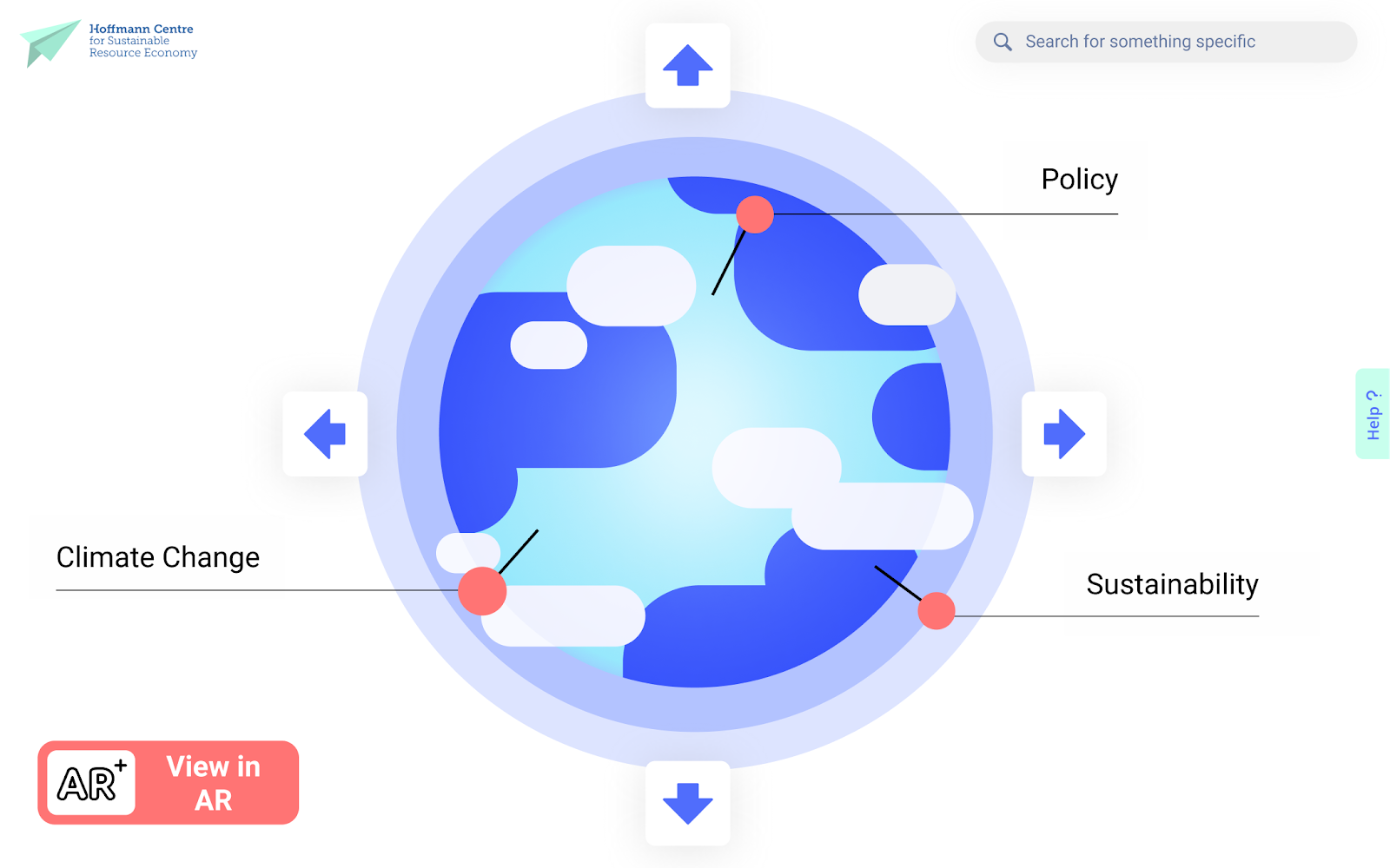
Taking from last week's development of the informational hierarchy, we decided to use the node link diagram in order to organise the information in 3D space, also bearing in mind Tatiana’s idea of axis arrangement. We have also implemented it in developing our idea of a personal library. It was very difficult to develop something as complicated as an AR without being in the same room. Hence we split up the process the same way we’ve done in the past weeks.
AR TIME
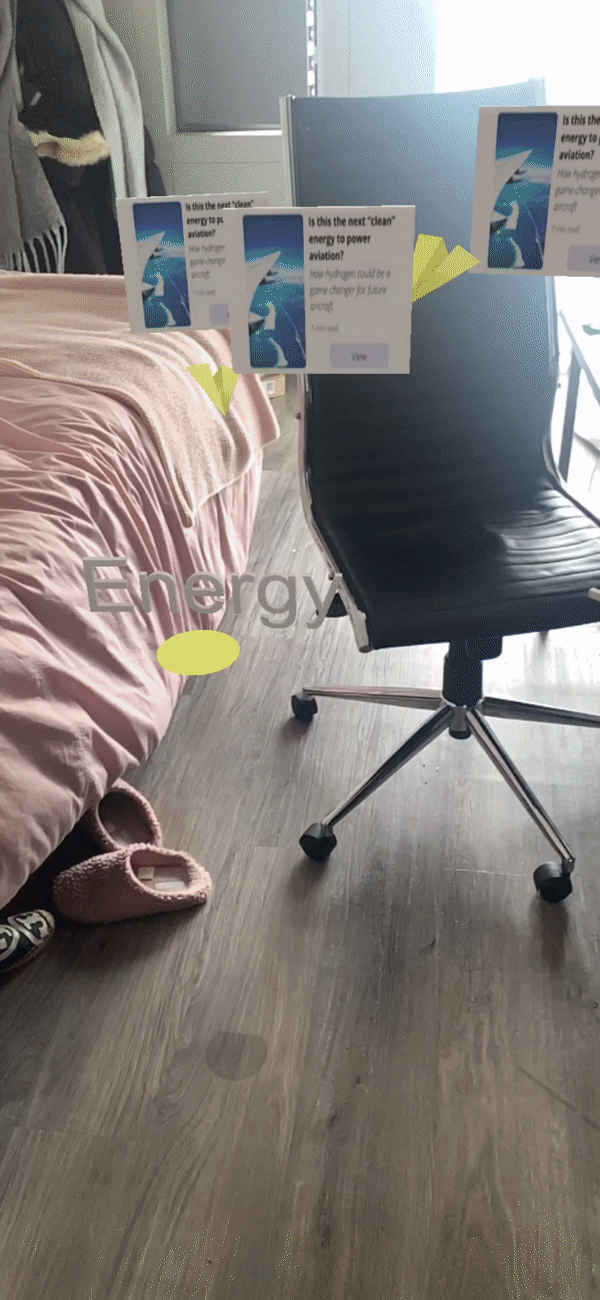
When it comes to AR, Tatiana started working on Adobe Dimension to develop the objects in 3D such as paper planes. Later on we had a hand-off meeting where she talked me through her progress so far and explained to me some basics of the software.
Throughout the process of development there were many obstacles and realisations. We first considered replicating the node link diagram in detail. However, we realised that the distancing of different topics didn’t work quite as well in AR as it did in 2D space as it made it confusing. Furthermore, we needed to find a way to bring the paper planes back in a manner that would enhance the experience.
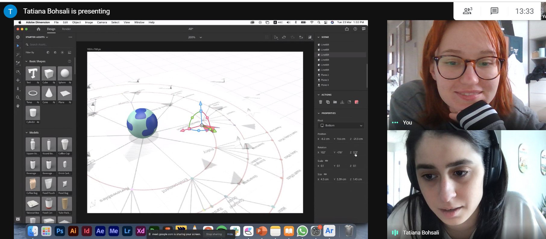
Meeting with Tatiana to discuss the AR prototype. She explained her progress so far and agreed on what needs to be done. Screenshot by Kate.
Throughout the process of development there were many obstacles and realisations. We first considered replicating the node link diagram in detail. However, we realised that the distancing of different topics didn’t work quite as well in AR as it did in 2D space as it made it confusing. Furthermore, we needed to find a way to bring the paper planes back in a manner that would enhance the experience.
At this stage, we remembered our initial aim involved creation of chaos. We decided to make the AR complimentary to the website instead of making it a separate experience, where the website would present a less animated and academic-oriented source. While the AR would present a more chaotic and creative approach to information sorting, getting rid of the axis, yet still keeping the node link principles.
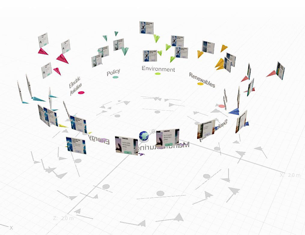
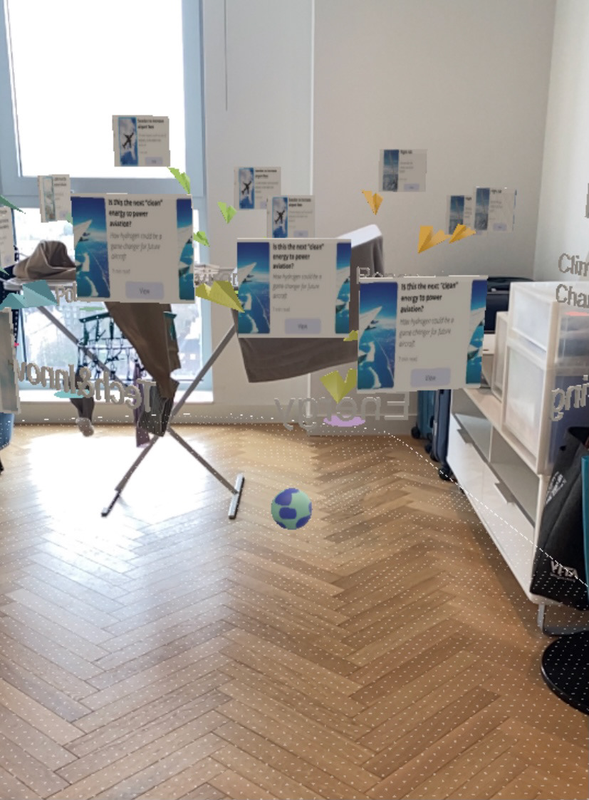
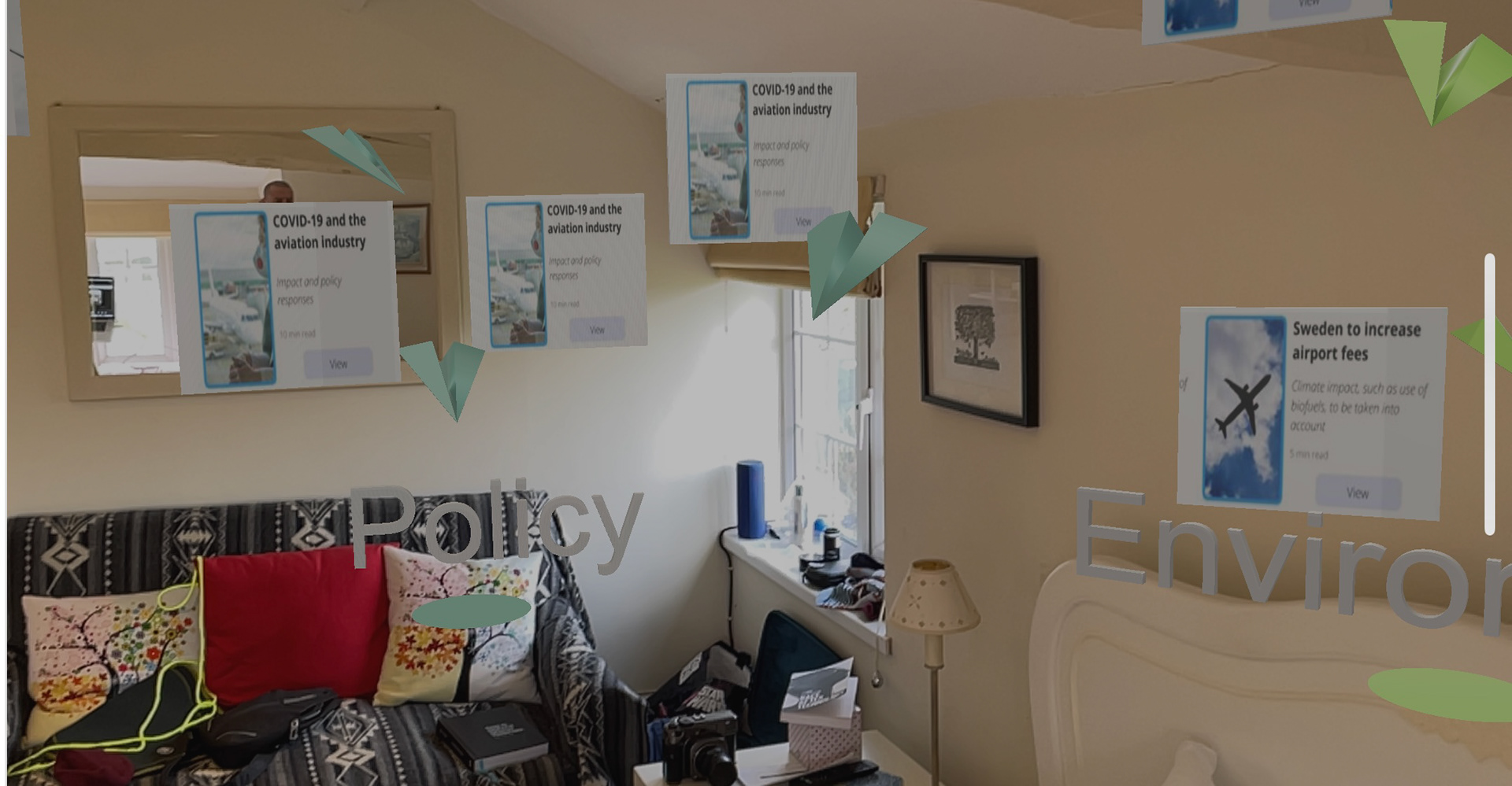
Final AR structure. Developed by Kate and Tatiana.
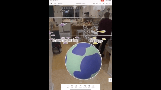
Progress video of the AR. Individual videos taken by Kate, GIF created by Maria.
To experience this AR, simply download Adobe Aero (unfortunately, only for iOS users) and scan this QR code:

WEBSITE
Meanwhile, we all tried to help a little with the website as it got very chaotic at some point since we really wanted to make sure people were able to navigate freely without us telling them what to do. This required developing a lot of different pages. Furthermore, throughout the process we were also able to bring back the paper planes, globe and the boarding pass metaphors back to the website. The latter became our connection between the website and AR giving the ability to switch from one to the other at any stage of exploration.


Our Figma page. Prototype developed collaboratively.
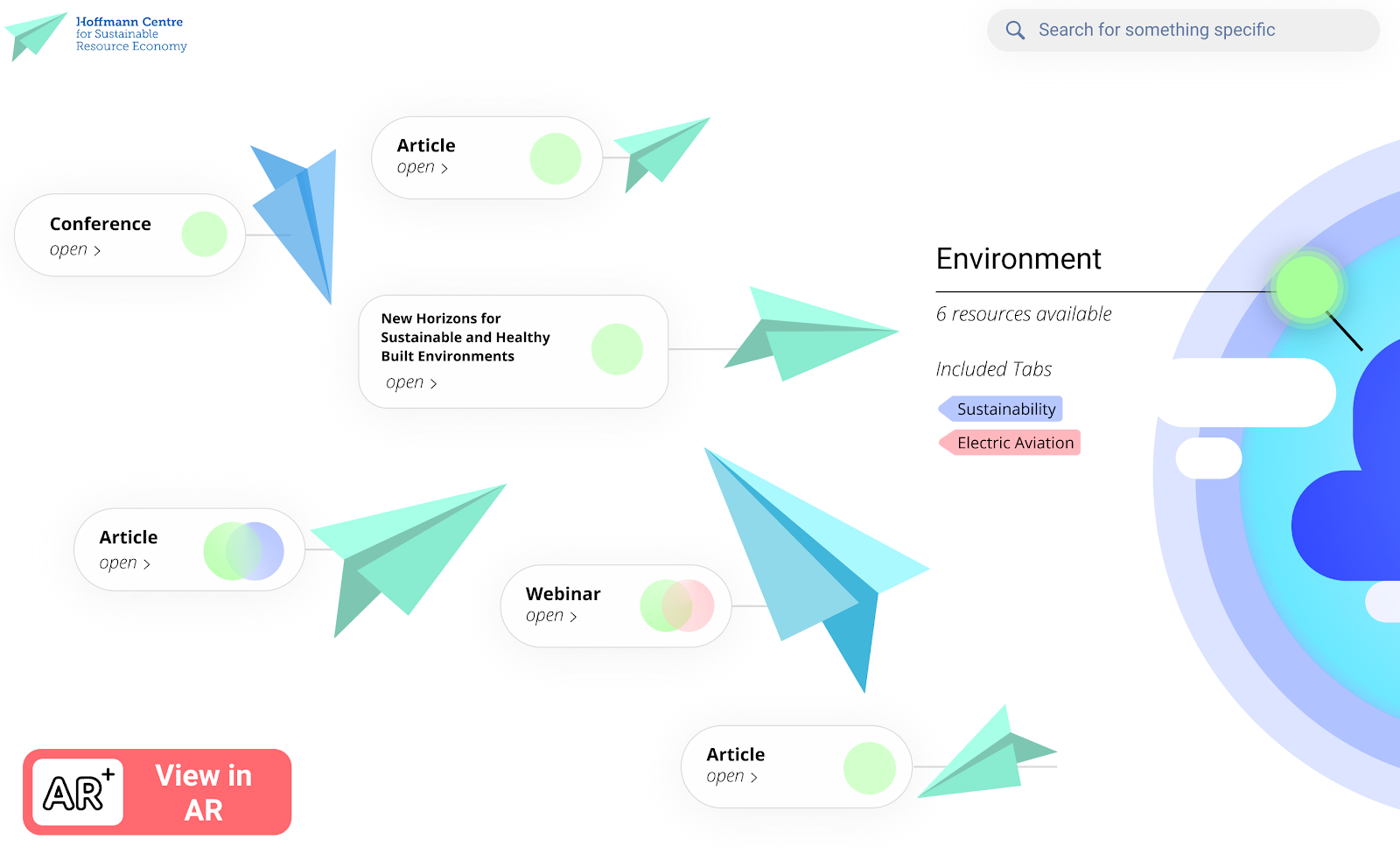
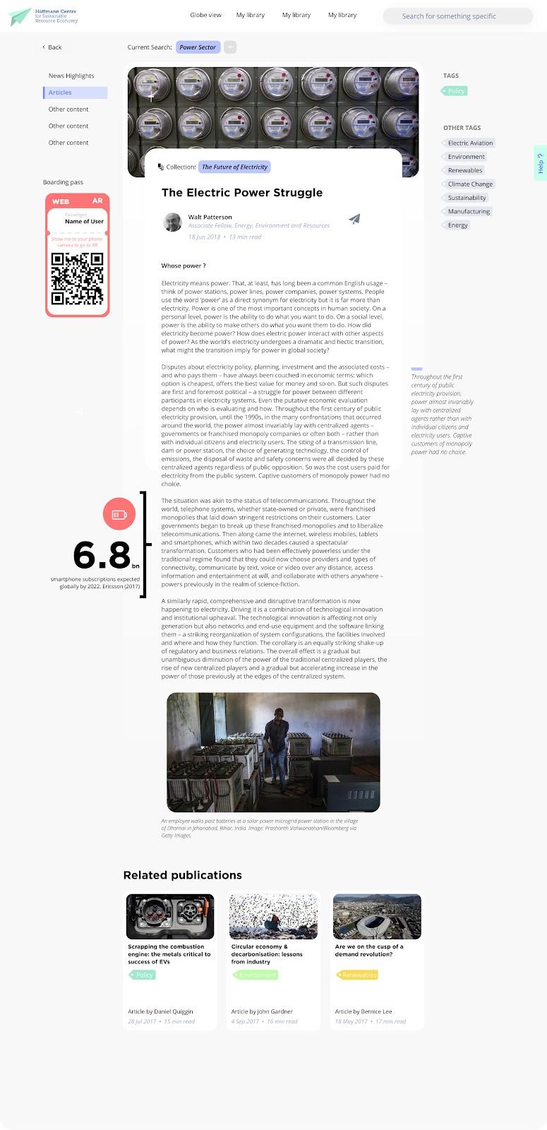
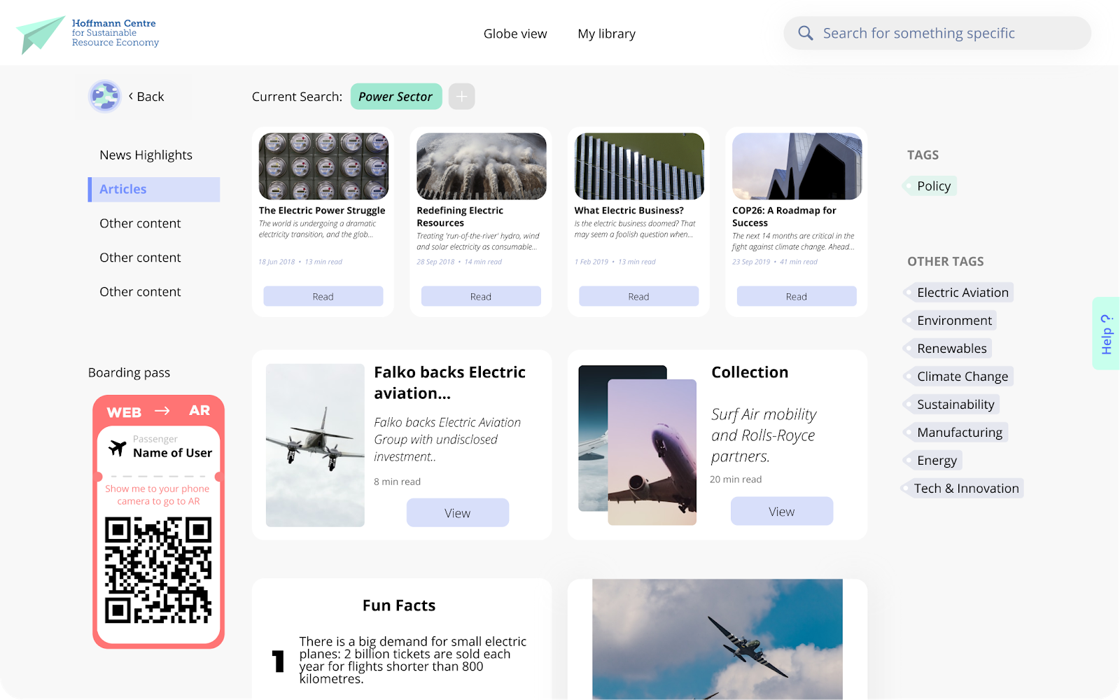
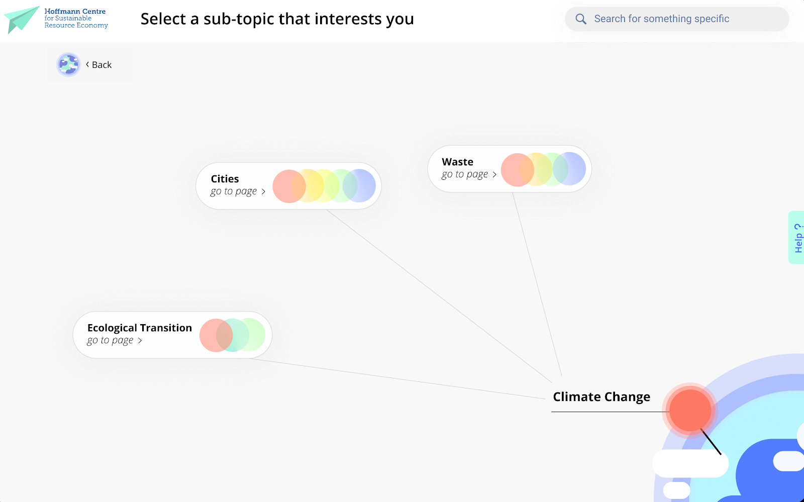
Some of the final pages of the website. Developed collaboratively on Figma.
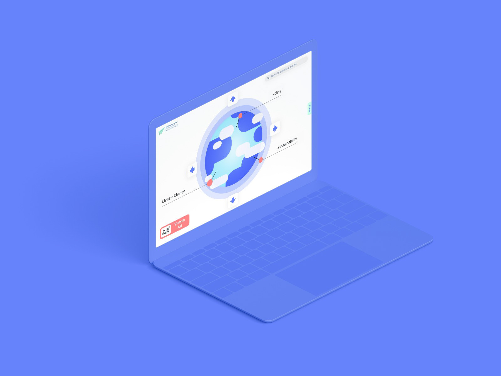
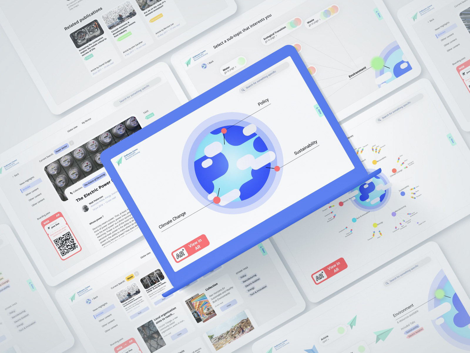
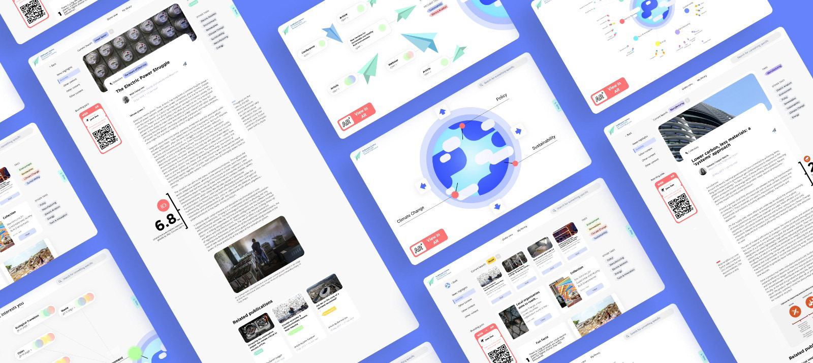
Mock ups of the website. Created by Maria.
To explore the final prototype of the website:
FINAL ITERATIONS AND PREPARATION
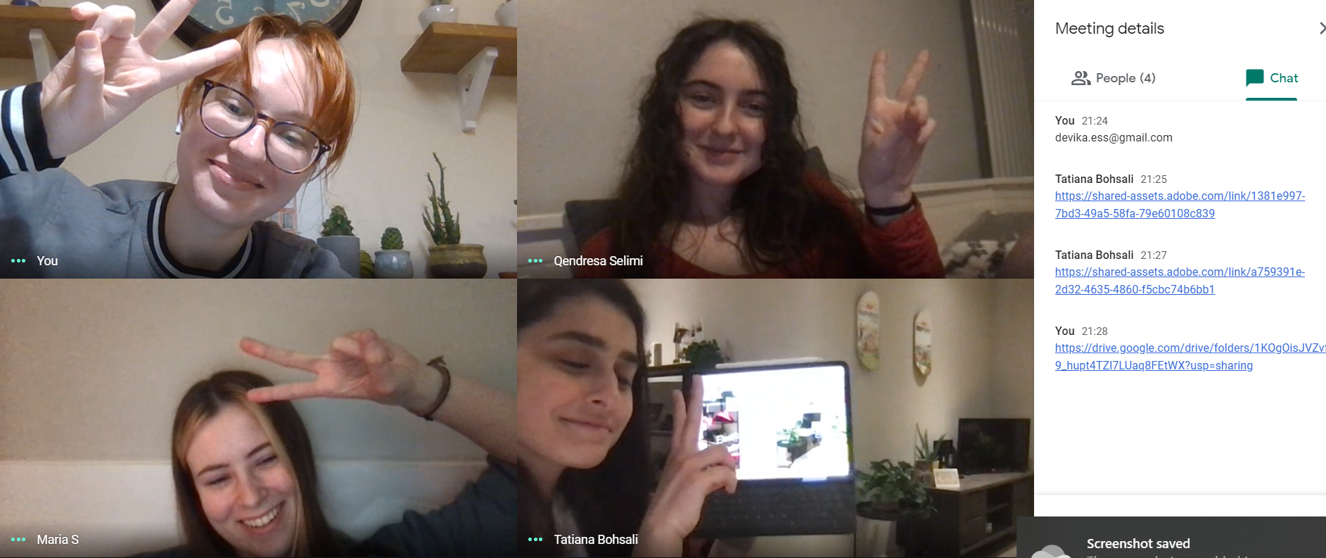
Our Dream Team the night before the presentation trying out our prototypes, making final small changes and making sure everything works. Screenshot taken by Kate.
Trying out Microsoft Teams before the presentation to ensure everything works as fine as it does through Google Meets and Zoom. Found some problems with screen sharing and sorted them out. Screenshot by Kate.
PRESENTATION & FEEDBACK

Some of the images we received from our classmates and tutors when they were trying out our AR experience and their feedback. Top left - by Sanjana Mehta, top right - Moxue Jia and bottom left - John Fass, bottom right - screenshot of the Teams chat with feedback taken by Kate.
The feedback for our final presentation was positively overwhelming. Tom and Callum from Applied Works really liked our outcome and commented that our idea of a personal library has a lot of potential and they would have loved to see it come to life, only if we had more time to work on the project. Similarly, they shared their positive thoughts on the development of the forum as a potential future for the project as it would make experience more complete. Furthermore, if we were to continue to work on this project, it would be a good idea to make it available for a wider audience through exploring other software, as Adobe Aero only works for iOS users. Nevertheless, our peers noted that it felt very interesting to be literally surrounded by information through the AR in your own room.
We have also received most flattering feedback from our course leader John, who mentioned how great we worked together as a team and that we responded to all of the feedback really well. We worked very hard on this project and both John and Alaistair said that it shows as we have managed to produce a great piece for our portfolios. Although, we realise that some of the things in the project could have been improved if we were given more time, it was still a relief to hear so many positive thoughts about our work. This project has given me an opportunity to improve my skills as a designer and work with talented and amazingly hard-working people!